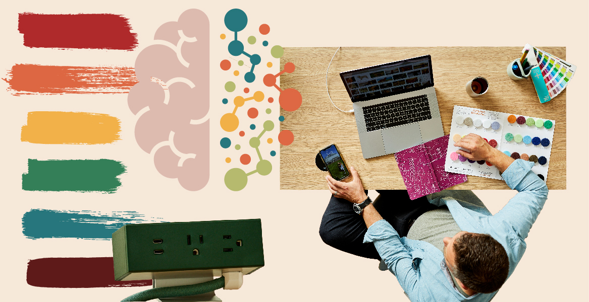
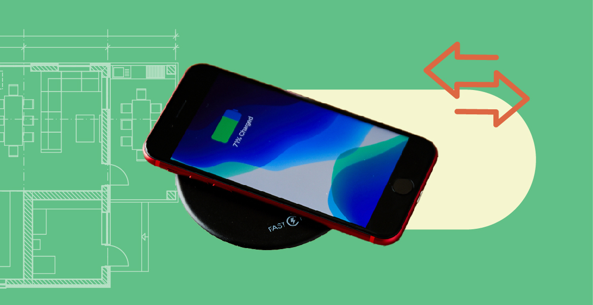
Byrne’s palette pros do their homework to help customers show their true colors.
It’s often been said that “green is Byrne’s color.” This may have something to do with our company-wide dedication to sustainability—well, that, and our founder’s unmistakable Irish roots. But one glance at our website and you’re sure to spot an array of colorfully cool options that stretch far beyond the emerald isle. In fact, we’ve had quite a few customers remark on our product palette and ask us how we go about choosing the colors we do. It’s an interesting question and there’s often more to consider than you might think.
Because, here at Byrne, we dream in color.
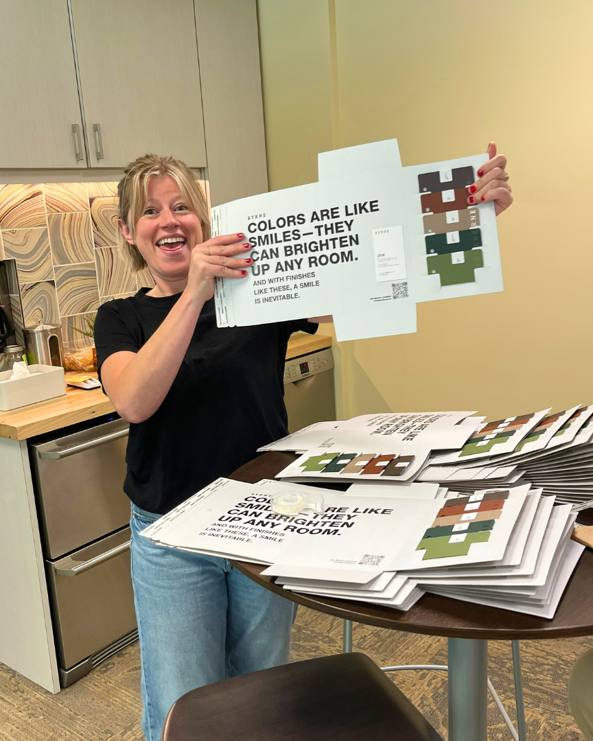
Kristen Hummel, our Senior Brand & Marketing Manager, thinks of color as not only a way to draw users in but to also help build powerful connections with the objects we use every day. “Powerful design speaks to people and color speaks to people,” says Hummel. “I love being able to help shape the personality of a product and a lot of that happens through color.”
For Hummel and the Byrne design team, color influences come from all over. They also do their homework by researching forecasts, studying market trends, and listening to what industry leaders have to say. And no one speaks louder than Pantone.
Just say the word and designers across the globe immediately think color. In 2000, The Pantone Color Institute began trend forecasting their Color of The Year, and ever since then, their December announcement for the coming year has become a hue-driven holiday of sorts awaited by designers, creators, and color enthusiasts alike. The institute’s experts investigate color use around the globe to not only gauge how colors are affecting design but also consumerism and market demands.
But beyond what’s hot and what’s not, some also believe that different colors can actually impact how people feel. Also known as chromotherapy or color healing, color theory suggests that specific colors and their frequencies can have a psychological—and even a physiological—influence on the body.
Kerry Rowe, a color and material design consultant based in West Michigan—and a trusted Byrne resource for thoughtful and strategic color planning—is quick to agree.
“Color and material decisions are an emotional catalyst that play a pivotal role in how customers perceive and value a company’s products,” says Rowe. “Effectively applied, these visual and tactile messages communicate a brand’s personality, and make the experience of owning and using products more emotionally appealing.”
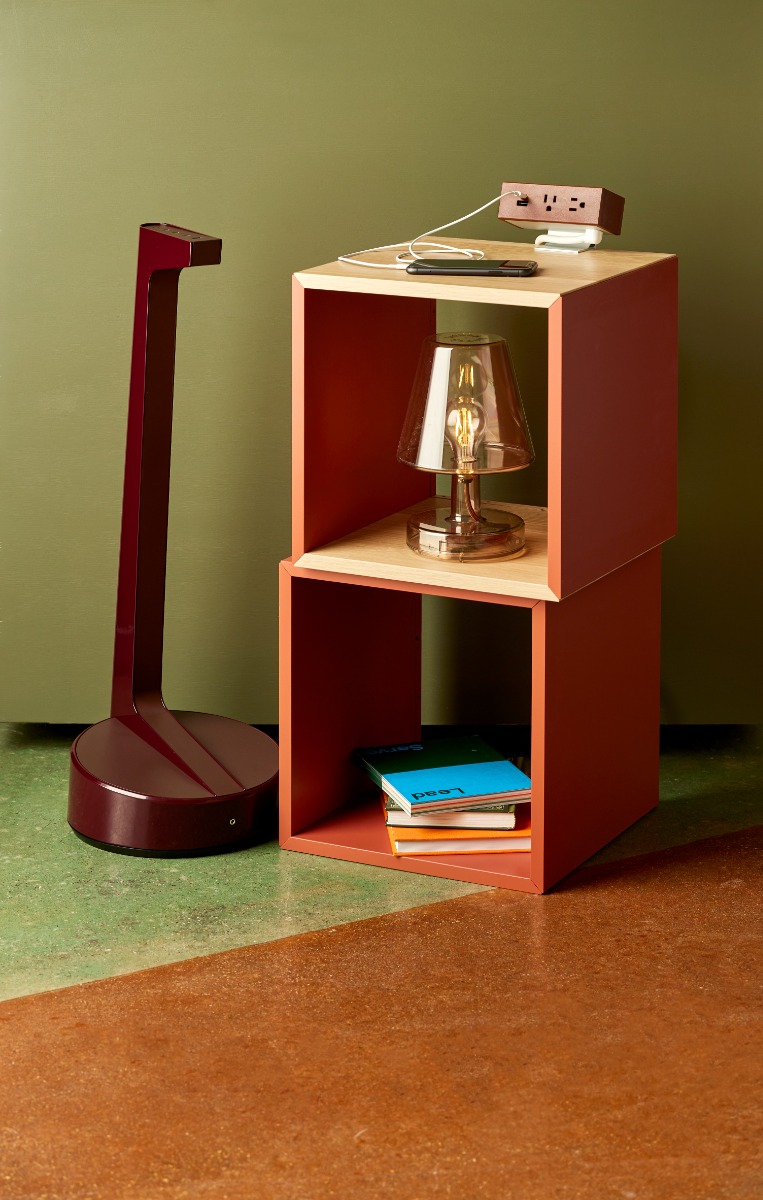
Byrne works to deliver that kind of appeal in both the dynamic offering of their standard products and palettes as well as the endless options available through fully customized solutions. Included on the standard side are the classic neutrals you’d expect that appear across product families and allow pieces to easily coordinate within the same space. Other desktop accessories, like Byrne’s new Finch, offer up rich, design-forward palettes that make an energetic mark on any environment.
Here are just a few colors from Byrne’s current collections with a little color theory thinking thrown in:
Pinecone
Taking its cues from nature, this deep brown helps users to feel grounded and brings the outdoors in.
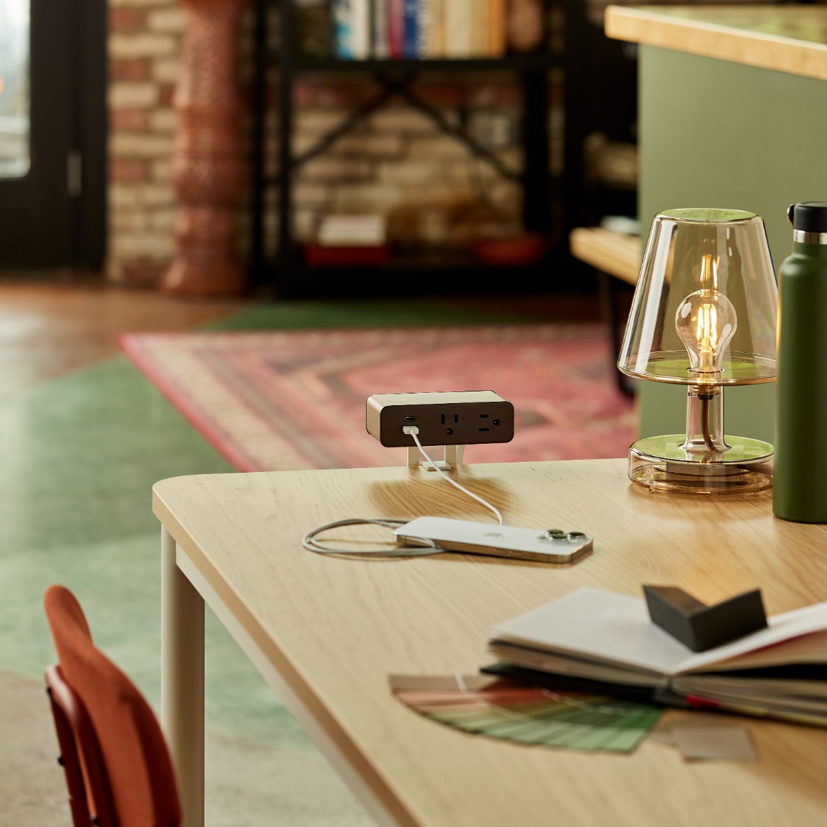
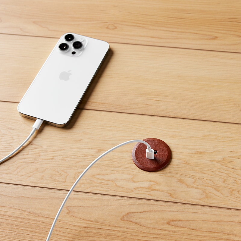
Clay
This southwestern-inspired color imparts security and warmth. Color aficionados will note that it evokes some of the same comforting feelings as Pantone’s Peach Fuzz, the 2024 color of the year.
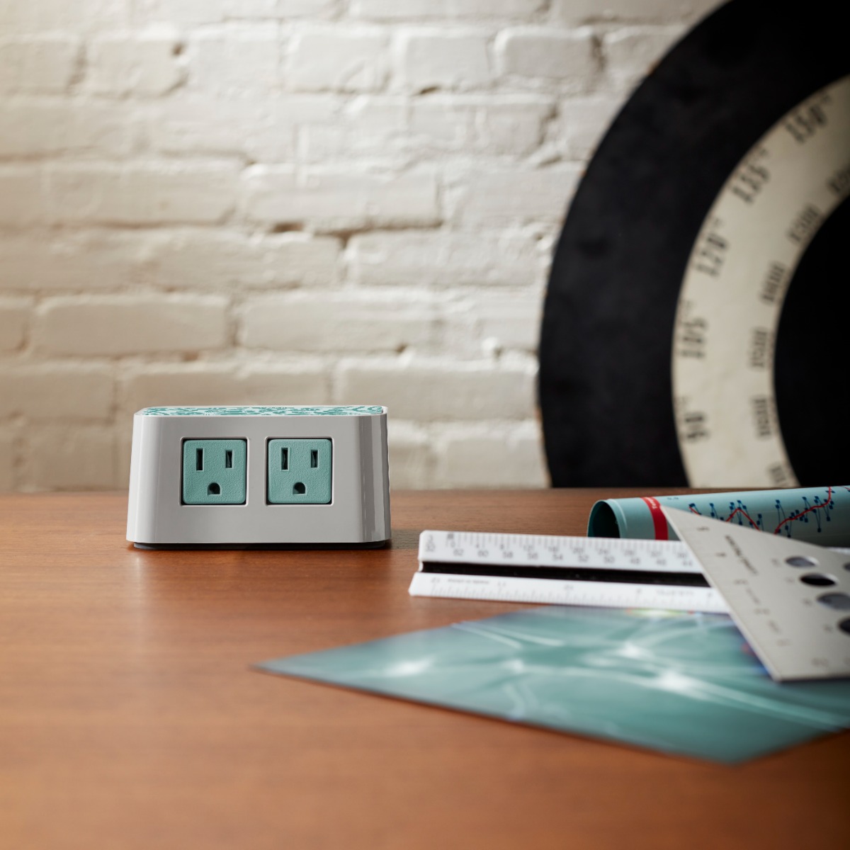
Dusk
An easy blue/gray mix, the shade is said to offer up much-needed calmness and serenity to any workspace.
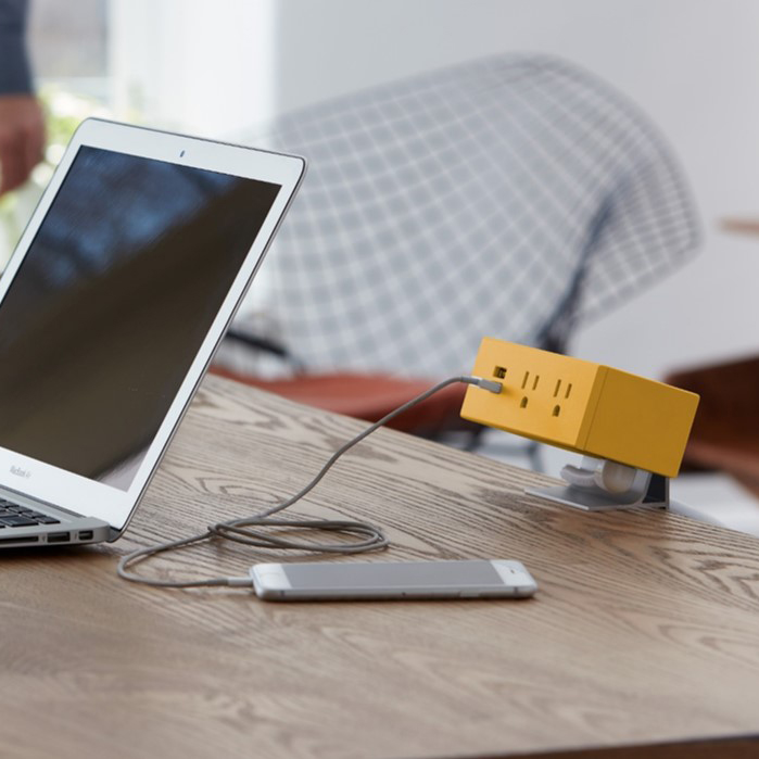
Honey
As a member of the yellow family, honey’s joyful vibe fosters positive communication and mental clarity.
White
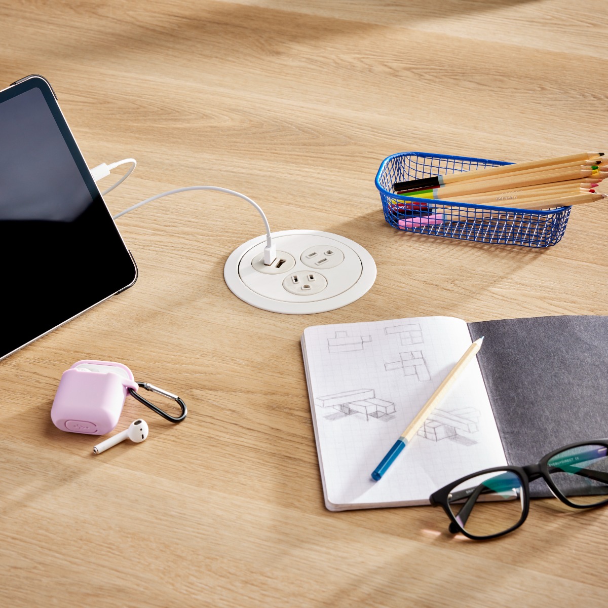
An essential in any product offering, white’s modern appeal delivers clean calm in busy environments.
Moss
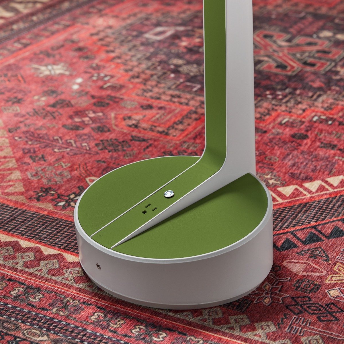
Because (as you’ll recall) green is our color, we always need a good one in the color deck. With our new Moss shade, users are not only apt to experience feelings of balance and serenity but may also increase motivation and focus.
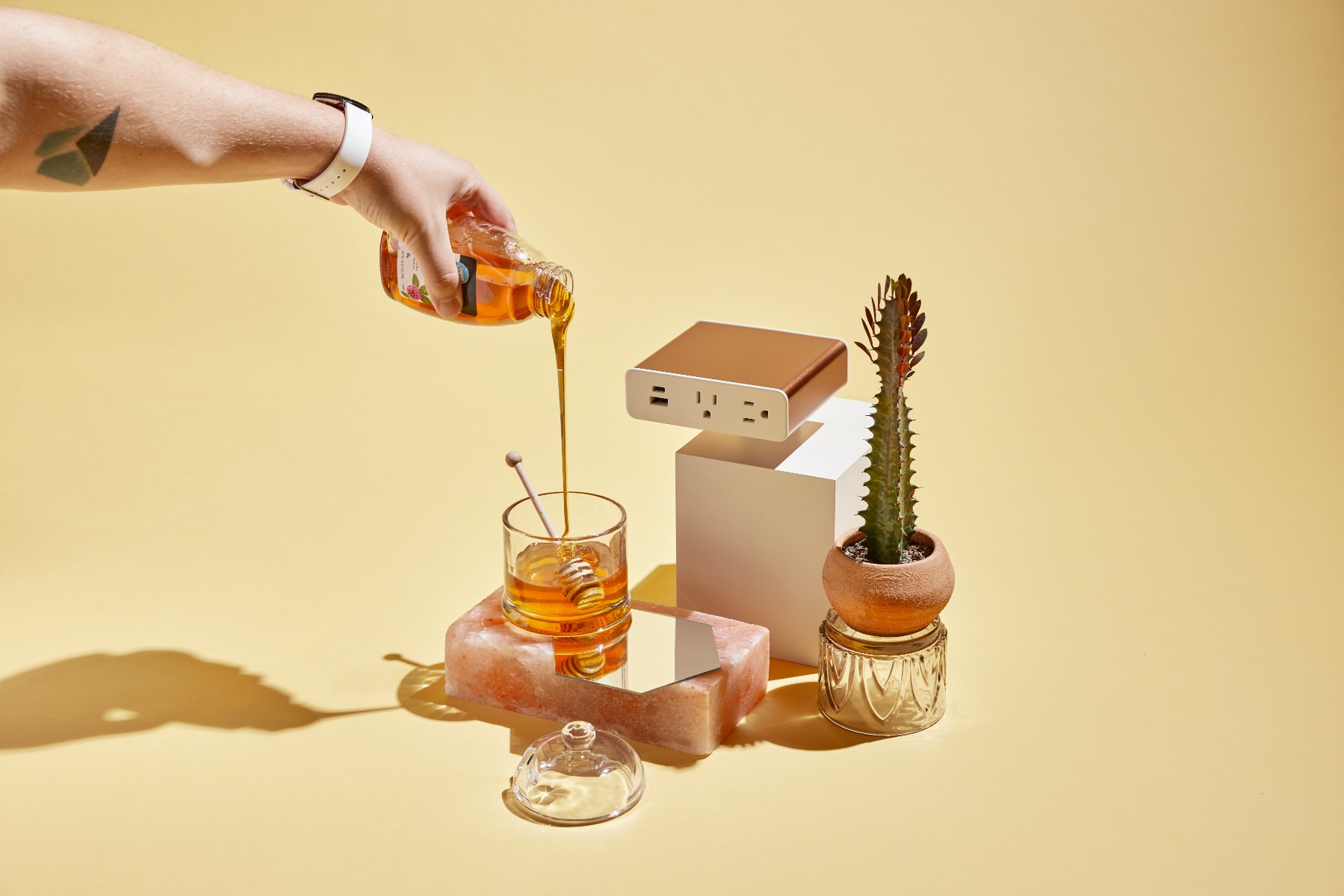
Metallic finishes like silver and copper are also stylish ways to promote excitement or creativity—wherever you can use a bit more energy—and wood not only offers visual warmth but the added benefit of a soothing, natural element.
When it comes to actually choosing the palette for a new product, Hummel and her team often begin by working collaboratively to target some general areas of the color wheel. They’ll batch similar colors and call out their favorites based on collective research and trend studies, as well as what might make sense for the personality of the product, its users, and the company as a whole. Throughout the process, there’s a lot of having to pare down the number of selections, reviewing swatches together and apart, in varying light, and on the potential materials themselves—plastics, powder-coated metals, veneer wraps, woven cords, and more. For Byrne’s color pros, it’s not just about choosing a good color, but what makes the best visual sense with others in the collection, striking an intentional balance of warm and cool tones as well as light and dark options.
At Byrne, color may live on the surface of an object, but the impact on customers often goes a lot deeper. From helping individuals to feel more relaxed and more focused to more stimulated and productive, colors have the potential to play a significant role in the way people interact with each product we offer. And with each other.
Now that’s some powerfully colorful design.


